Embrace
Oil on Canvas - 97cm x 60cm x 4mm depth - £750
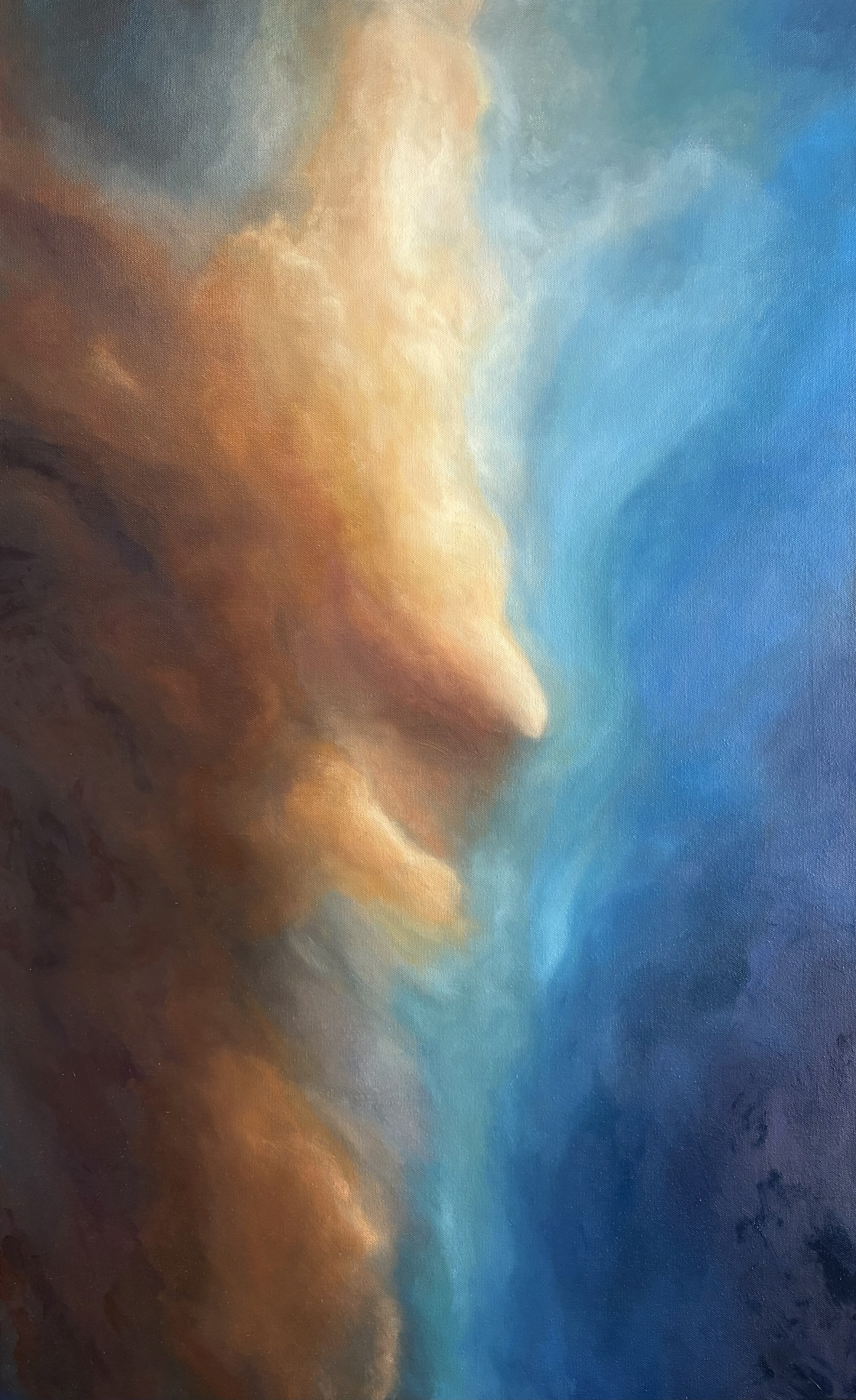
There is something quite instinctive about Embrace. The painting came from an interest in the way contrasting colours can sit alongside one another and still feel connected.
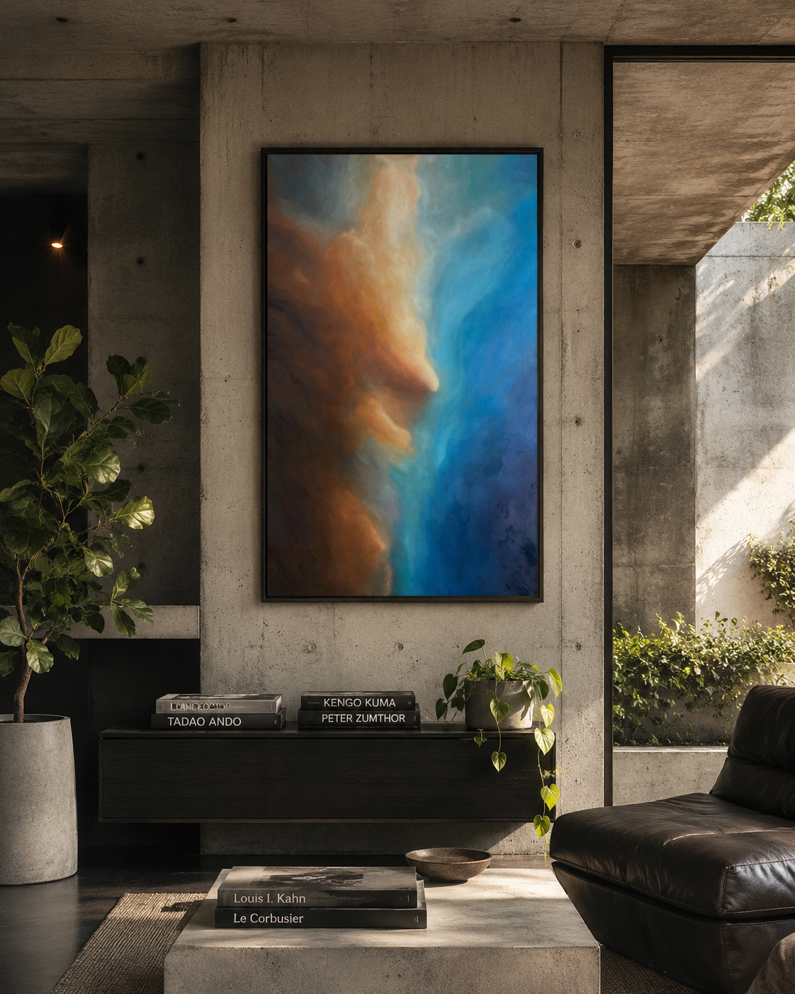
Warm ochres, burnt oranges and deeper earth tones gradually move into cooler blues and turquoise, creating a sense of two different worlds coming together. The central movement of the painting draws the eye through these colours, almost as though light is breaking through something darker.
For me, the painting is about connection. The title Embrace reflects that feeling of opposites coming together. Warmth and cold, darkness and light, strength and softness. Rather than representing a particular landscape or place, the painting is intended to leave room for the viewer to find their own meaning within it.
There is a quietness to the painting despite the strength of its colours. It is about finding balance between contrasting elements and the feeling that sometimes comes from simply allowing those opposites to exist together.